When the heart became a landmark
Strategic environmental design transformed a new healthcare identity into a recognizable system connecting a growing hospital campus with more than 20 community locations.

St. Tammany Health System’s illuminated interlocking hearts make the South Tower a recognizable landmark and extend the identity into the architecture of the main hospital campus.
Making the identity part of the landscape
When St. Tammany Parish Hospital introduced its new health system identity in 2019, I was responsible for carrying that identity into the physical environment.
The main campus presented the most visible opportunity. A new patient tower was under construction, and its architectural plans still included the hospital’s former logo. Updating that treatment would identify the new building, but it would not connect the tower with the established hospital on the opposite side of the campus.
I recommended installing St. Tammany Health System’s interlocking hearts on the new patient tower and repeating the same architectural treatment on the existing South Tower.
I had already begun using the interlocking hearts independently across publications, digital communications and promotional materials. The full logo established the organization’s name. The interlocking hearts provided an immediate visual connection to the health system without requiring someone to read the complete identity from a distance.
Sign Lite fabricated the two illuminated signs and installed them within days of each other. The matching treatments connected buildings constructed in different eras and made the new identity visible from multiple approaches to the campus.
That visibility also served a practical purpose. Patients and visitors begin navigating a healthcare campus long before they reach a lobby directory. A recognizable, illuminated landmark can confirm their arrival and provide an initial point of orientation across an unfamiliar property.
The South Tower installation became one of the most prominent expressions of the new identity. Behind it was a much larger environmental branding program extending throughout the hospital campus and more than 20 community locations
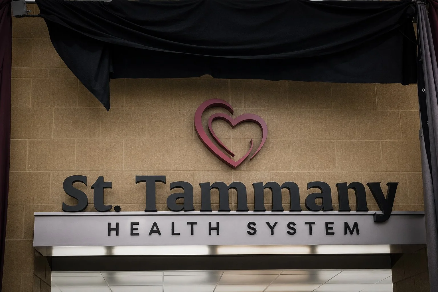
St. Tammany Parish Hospital unveiled its new St. Tammany Health System identity during its 65th-anniversary celebration on Dec. 1, 2019, setting the stage for the systemwide environmental rollout.
From public reveal to working system
The anniversary celebration introduced the new identity to the community. The work that followed determined how consistently people would experience it.
St. Tammany had grown beyond the hospital campus into a network of clinics, specialty facilities, emergency services and acquired practices. Those locations included purpose-built medical buildings, converted offices and storefronts. Their exterior signs reflected different stages of the organization’s growth, with variations in size, construction and available space.
My responsibility was to bring those locations into one recognizable system.
I developed a monument standard using a red logo header, gray information field, white divider and black base. The dimensions could adapt to different structures, but the colors, typography, spacing and information hierarchy remained consistent.
Every design began with the patient’s approach to the facility. What would someone need to recognize from the road? Which name identified the destination most clearly? Which services belonged on the monument? Could a driver understand the information quickly? Did the directional signs lead visitors toward the correct entrance?
The answers shaped the hierarchy. The identity connected the location to St. Tammany Health System. The facility name established the destination. Service information and directional elements helped patients understand where to go next.
I led the program from design through implementation, coordinating operational leaders, Building Services and Sign Lite. Operational leaders verified the accuracy and usefulness of the information. Building Services and the fabricator helped resolve construction and installation requirements. I remained responsible for translating those contributions into a consistent, production-ready system.
At this scale, decisions required objective standards. Every choice had to serve the patient, respond to the property and protect the integrity of the health systemwide identity.
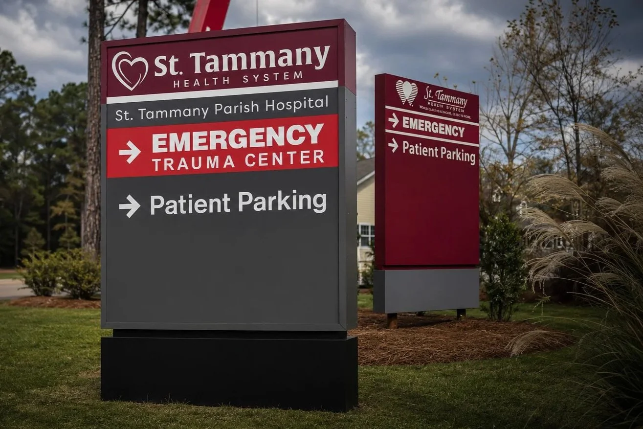
The outgoing monument in the background relied heavily on a single field of maroon. Its replacement introduced a clear hierarchy for the health system identity, facility name, emergency services and directional information.
Building the new identity around what already worked
The main-campus installation captured the transition between the two identities. The outgoing monument in the background relied heavily on a single field of maroon. The new monument in the foreground introduced a clearer hierarchy, separating the St. Tammany Health System identity, facility name and supporting information into distinct visual fields.
This hierarchy improved more than the appearance of the signs. It established the order in which information should be recognized and proved especially important at emergency locations, where approaching drivers needed to identify the facility, locate emergency services and understand where to turn within seconds.
Applying that standard across more than 20 locations required each property to be evaluated individually. Monument dimensions, construction, illumination, sign area and information needs varied throughout the network. Each design had to respond to those conditions while remaining recognizably part of the same system.
Where existing monument structures remained usable, we retrofitted them with new interior LED systems and updated the exteriors to reflect the new visual identity. Sign Lite had fabricated many of the original structures and retained the production drawings. Using those records, I reconstructed the layouts in Adobe Illustrator and adapted the new design to monuments with different dimensions and configurations.
New monuments were fabricated where additional signage was required. The same hierarchy, materials and production standards connected those installations with the retrofitted signs, allowing the identity to remain consistent as the health system continued to grow.
I led the work from design development through production, coordinating operational leaders, Building Services and Sign Lite. Operational leaders confirmed facility names, services and directional information. Building Services contributed knowledge of each property and managed the facilities requirements. I worked directly with Sign Lite to resolve dimensions, materials, LED illumination, fabrication methods, pricing and installation while maintaining responsibility for the visual system and final design.
Each location moved through coordinated review, revision, pricing and approval before fabrication began. Establishing repeatable design and production standards gave everyone a common framework, improved the efficiency of subsequent projects, reduced revisions during production and protected the health system’s investment across the larger rollout.
The work extended beyond roadside monuments. Depending on the property, a complete signage package could include entrance and exit signs, directional elements, building identification, interior applications and architectural installations of St. Tammany Health System’s interlocking hearts.
Together, those elements created a continuous experience. The monument identified the location from the road. Directional signs guided the approach. Building-mounted graphics confirmed the destination. Interior applications carried the identity through the entrance.
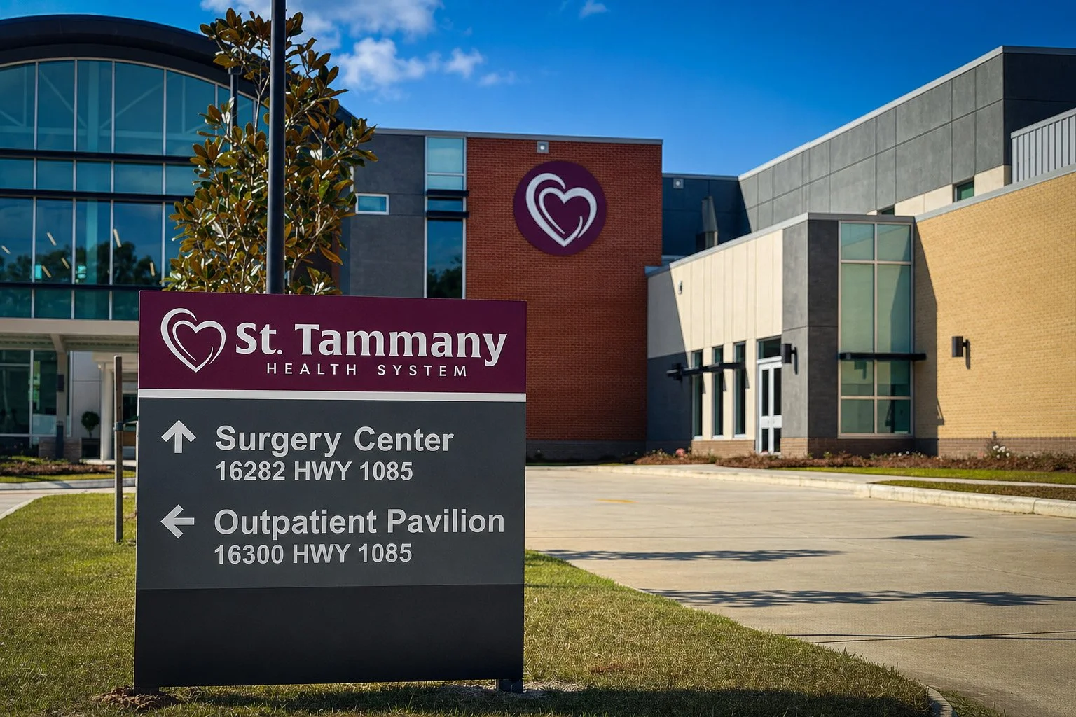
At the Surgical Center and Outpatient Pavilion, the monument’s information hierarchy helps drivers identify two destinations and understand where to turn before entering the property.
Creating a system that could grow
A healthcare signage program has to accommodate change. Physicians move, services expand, practices are acquired and new facilities open. Permanent signs should be designed around the information most likely to remain useful.
Our general standard kept individual physician names off monuments. In most cases, the facility name and its services provided more durable information for patients. The production method made that distinction financially important. Changing a name on an internally illuminated sign could require rebuilding the panel, while removing surface-applied lettering after years in the Louisiana sun could leave visible ghosting.
The standard allowed purposeful exceptions. Family medicine practices often depended upon established physician-patient relationships, making a physician’s name useful in identifying the location. Another exception accompanied the acquisition of an established medical practice when retaining the physician’s name supported the agreement and transition.
Those decisions are part of brand governance. Consistency does not mean treating every location identically. It means establishing a clear standard, understanding the purpose behind it and applying informed judgment when circumstances require a different solution.
Over roughly a year, I led the environmental implementation of the St. Tammany Health System identity through architectural planning, site evaluation, design, internal review, pricing, fabrication and installation.
The completed program made the new identity part of the hospital’s architecture, retrofitted every existing monument and created a shared visual language across more than 20 community locations. It also established a practical system that could support new facilities, additional signage and future organizational change.
That is the work I bring to TSF Strategies: translating an identity into the physical environment, coordinating the people responsible for delivering it and managing the strategic, operational and financial decisions behind the finished work.
St. Tammany Health System’s interlocking hearts became a landmark because the identity was supported by a system built to work everywhere else.