Designing for what comes next
A flexible brand system gives organizations the consistency to introduce new ideas, technologies and experiences while remaining immediately recognizable.
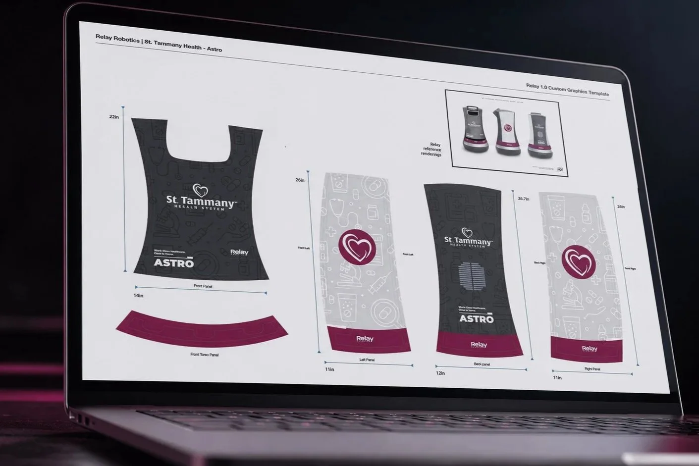
Brand development for ASTRO translated St. Tammany Health System’s established visual language into a detailed wrap design for an autonomous courier robot.
Building a scalable identity
In its 2024 Annual Report to the Community, St. Tammany Health System introduced ROSIE and ASTRO, two autonomous courier robots making deliveries between departments at St. Tammany Parish Hospital.
The robots represented an entirely new brand touchpoint for the organization. While serving as the health system’s creative and brand director, my role was to help give them names and a visual identity that belonged within the larger St. Tammany brand.
The assignment presented a strategic question: How do you introduce something entirely new while making it feel connected to everything the organization has already built?
We approached the naming process with the possibility that additional robots could eventually join the fleet. We needed names that were recognizable individually but also belonged to a larger family that could expand without requiring a new naming strategy each time.
As a team, we considered several familiar groups of characters. The Jetsons ultimately provided the strongest foundation. Rosie was already one of popular culture’s most recognizable robots, while Astro gave the second robot a natural companion. George and other characters offered additional possibilities if the fleet ever grew.
The names made the technology feel more approachable. ROSIE and ASTRO had individual identities, but their connection was immediately understandable. Together, they felt like members of the same family and part of the same organization.
Most importantly, the naming system addressed the immediate assignment while leaving room for whatever might come next.
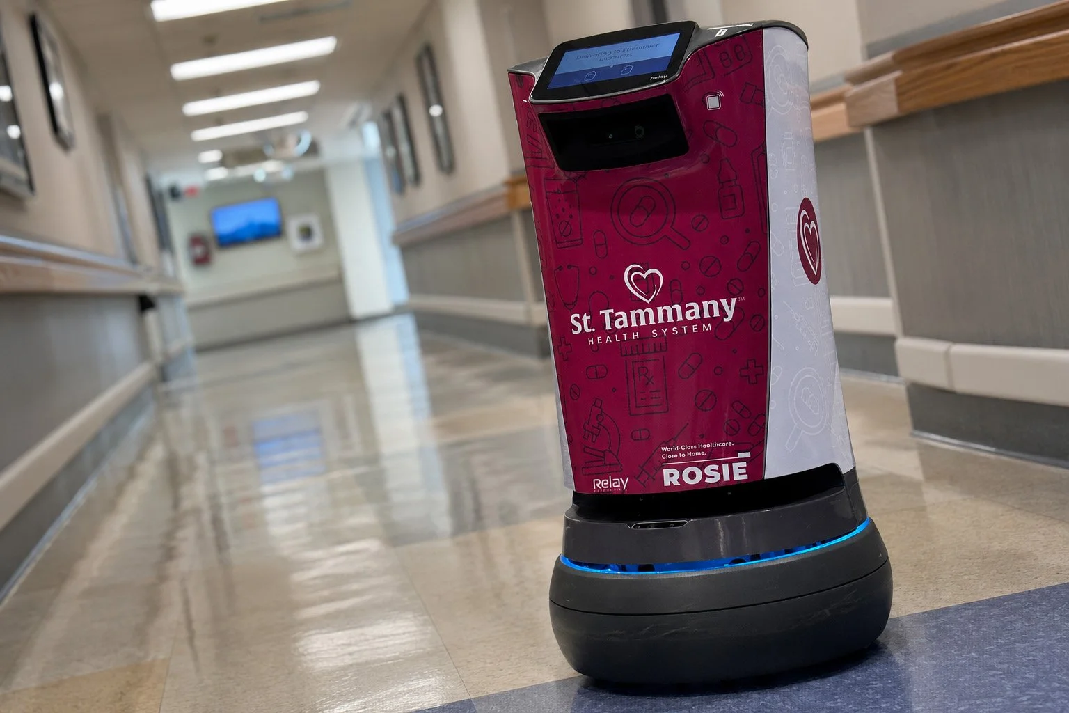
ROSIE travels through St. Tammany Parish Hospital in a custom wrap designed to connect the autonomous courier robot with St. Tammany Health System’s established visual identity.
Extending the visual language
By 2024, I had developed and maintained a consistent visual identity for St. Tammany Health System across badges, podiums, print collateral and other branded materials. I had also carried the organization’s burgundy-and-gray palette into its monument signage and broader environmental design program.
Those elements provided the foundation for the robot designs. The full St. Tammany Health System logo appeared prominently on the front of each robot, while the health system’s service mark—white interlocking hearts within a burgundy circle—created a bold, recognizable presence on the sides. Their consistent placement, supported by the familiar color palette, immediately identified ROSIE and ASTRO with the organization.
The size and unusual shape of the machines called for an additional layer of visual interest. Working closely with the primary stakeholder responsible for the deployment, I developed a repeating pattern of healthcare-related line art featuring microscopes, prescription bottles and other familiar medical imagery.
The fine line work introduced texture without competing with the primary brand elements or overwhelming the robots’ forms. Subtle from a distance, the individual illustrations revealed more personality up close.
Variations in the pattern’s color, scale and placement gave ROSIE and ASTRO distinct treatments while preserving a cohesive visual system. The result translated an established brand onto a moving piece of technology while allowing each robot to have an identity of its own.

ASTRO moves through St. Tammany Parish Hospital in a custom wrap that extends St. Tammany Health System’s visual identity into a new technology-driven environment.
Creating room to grow
The medical line-art pattern soon proved useful beyond the robot assignment. It became a secondary brand asset that I could adapt for tablecloths, technology stations, charging stations, banners, wraps and other applications that called for something more expressive than a solid field of color.
Once established, the pattern gave each new application a recognizable visual starting point. Color, scale and composition could change to suit the environment while maintaining a clear connection to the larger St. Tammany identity.
That became one of the project’s most valuable outcomes. A solution developed for one unusual assignment added a flexible new tool to the health system’s visual vocabulary.
The naming convention and visual system were built around the same principle. Both met the immediate need while leaving room for additional robots, colors, formats and branded applications.
That is where a cohesive brand system proves its value. Brand standards provide consistency, but they must also be flexible enough to accommodate new environments, technologies and applications that may not have existed when those standards were created.
ROSIE and ASTRO made the assignment fun and memorable. The larger accomplishment was connecting an unfamiliar new touchpoint to the established St. Tammany brand and creating a visual asset that continued working well beyond the original project